Setting Background Image and Gradation and How to Repeat Them
1. Background Image
background-image:url('image-file-path')
Set's the background-image.
When the given image is smaller than the size of element, background image is repeated.
Repeating method is determined through 'background-repeat' property.
2. Repeating the Background
background-repeat:(repeat/repeat-x/repeat-y/no-repeat)
Set's the way how the background will be repeated.
- repeat: Default value. Repeats along both x-axis and y-axis.
- repeat-x: Repeats along x-axis.
- repeat-y: Repeats along y-axis.
- no-repeat: No repeating. Indicates only once.
3. Positioning Background Image
background-position: (left | center | right | <percentage> | <length>)(top | center | bottom | <percentage> | <length>)
- horizontal offset: Sets horizontal location.
- vertical offset: Sets vertical location.
4. Applying Background to Other Area
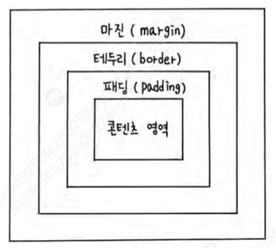
background-origin:(content-box | padding-box | border-box)
Set's where the background should apply.
It can be content-box, padding-box(default), border-box.
- content-box: Background is applied to content box only.
- padding-box: Background is applied to padding-box. Default value.
- border-box: Background is applied to border-box.
5. Fixing Background Location
background-attachment: (scroll | fixed)
Background image is fixed when this property is used.
- scroll: The background image scrolls along with the page content.(Default)
- fixed: The background image stays fixed in place while the rest of the page scrolls.
6. Using 'background' Property to Adjust 1~5 At Once
background:url("filepath") (repeat) (position) (attachment)
Input sequence can be different.
7. Changing Background Size
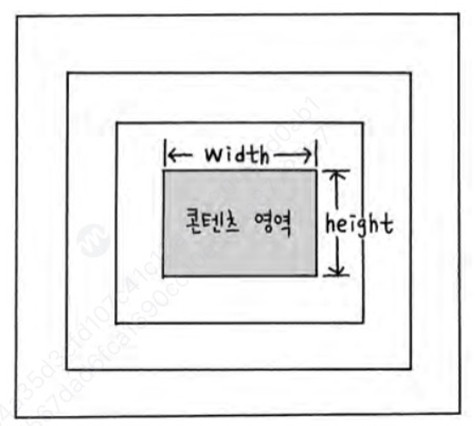
background-size:(auto | contain | cover | <size> | <percentage>)
You can also change background-size.
- auto: Display background image in its original size. Default value.
- contain: Resize the image so that background image can fit into the element.
- cover: Resize the image so that background image can cover the whole element.
- <size> Set width and height of the image. When only one value is given,
height is automatically calculated and this value is set as width.
- <percentage> Resize the image proportional to the element depending on given percentage.
8. Gradation
There are two types of gradation - 'Linear Gradation', 'Circular Gradation'.
Former one gradates linearly, latter the circularly.
(1) Linear Gradation
linear-gradient(to (<direction> or <angle>), (starting color), (mid color1), (mid color2)..., (ending color))
repeating-linear-gradient(to (<direction> or <angle>), (starting color), (mid color1), (mid color2)..., (ending color))
- direction: Use keywords (left/right, top/bottom) for direction. Keywords can be used together for diagonal directions.
- angle: Use angle for direction. The angle increases in clockwise direction, starting from upside (+y axis).
- starting color: Starting color for gradients.
- mid color(n): Mid colors for gradients. Comes after starting color.
- ending color: Ending color for gradients. Comes after mid colors.
Use repeating-linear-gradient to repeat gradation.
(2) Circular Gradation
radial-gradient((<shape>) (size) at (starting color), (mid color1), (mid color2),... (ending color))
- shape: Either 'epllipse' or 'circle' can be used as its value. Defaykt us 'ellipse'.
- size: Used to adjust the size of ellipse or circle. Its value can be 'closest-side', 'closest-corner', 'farthest-side', 'farthest-corner'.
- starting color: Starting color for gradients.
- mid color(n): Mid colors for gradients. Comes after starting color.
- ending color: Ending color for gradients. Comes after mid colors.
Use repeating-radial-gradient to repeat gradation.
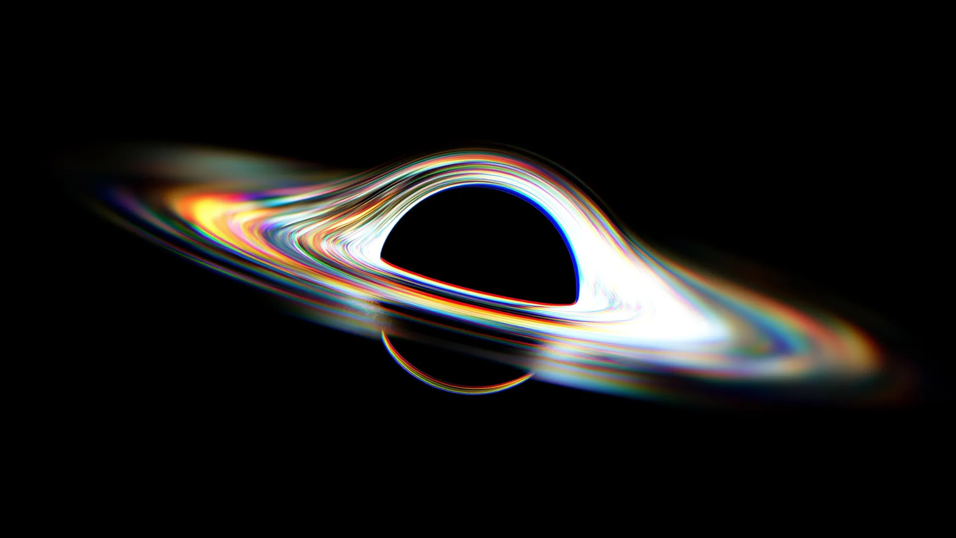 There's one massive object in the universe that absorbs everything it encounters - the blackhole.
This thing is created by a supernova - death of a massive star.
Even light can't escape from it.
Some scientists suggest that in the far future we might be able to time travel using a blackhole.
We don't actually know whether this will really happen or not, but studying this fascinating object will improve our overall technologies.
There's one massive object in the universe that absorbs everything it encounters - the blackhole.
This thing is created by a supernova - death of a massive star.
Even light can't escape from it.
Some scientists suggest that in the far future we might be able to time travel using a blackhole.
We don't actually know whether this will really happen or not, but studying this fascinating object will improve our overall technologies.